


Because this was a rebrand for a business that already had a great reputation for exceptional care, we knew we needed to maintain and leverage as much of that brand equity as possible while providing a comprehensive new visual identity that captured the core mission of the business. Paramount to the rebrand was finding a new business name that clearly and simply conveyed the service offered and reinforced the organization’s commitment to enabling seniors to stride confidently through their golden years, supported by compassionate and personalized care.

We approached this rebrand with a mission-first mindset, visually translating the heart of the business’ mission into rich, approachable tones with sophisticated accent colors that differentiated them as a business but didn’t stray too far from their former brand or diminish established brand equity.
For elements and imagery, we used sketched illustrations and icons that showcase the nurturing care that Senior Stride provides. We incorporated lighthearted imagery showcasing both seniors enjoying their independent lives as well as the smiling faces of caregivers that evoked a feeling of genuine care and happiness.
We crafted a typographical hierarchy with a two-fold approach, knowing we wanted modern “high-end” fonts that felt welcoming and premium while also making sure that the selected fonts would be well-contrasted and easy to read for the intended audience.
When crafting the new name, we followed our process and chose Senior Stride to clearly and easily capture the core message of the business–”We help seniors find their stride.” Pairing this message with a new, modern logo with a sense of movement that represented each client’s journey.


Senior Stride’s new brand embodies a sense of vitality and empowerment and conveys a simple, clear message to their clients about their core service and philosophy of care. Each element of the new brand works together to create a comforting, consistent feeling across all touchpoints.


Working with Quill on our annual report always leaves us with a compelling and impactful piece that helps tell our story and illustrate how we are living out our mission. We are always excited to share the finished product with our donors and partners.
Lisa Endl, Director of Communications, Feeding America Eastern Wisconsin


Because this was a rebrand for a business that already had a great reputation for exceptional care, we knew we needed to maintain and leverage as much of that brand equity as possible while providing a comprehensive new visual identity that captured the core mission of the business. Paramount to the rebrand was finding a new business name that clearly and simply conveyed the service offered and reinforced the organization’s commitment to enabling seniors to stride confidently through their golden years, supported by compassionate and personalized care.


We approached this rebrand with a mission-first mindset, visually translating the heart of the business’ mission into rich, approachable tones with sophisticated accent colors that differentiated them as a business but didn’t stray too far from their former brand or diminish established brand equity.
For elements and imagery, we used sketched illustrations and icons that showcase the nurturing care that Senior Stride provides. We incorporated lighthearted imagery showcasing both seniors enjoying their independent lives as well as the smiling faces of caregivers that evoked a feeling of genuine care and happiness.
We crafted a typographical hierarchy with a two-fold approach, knowing we wanted modern “high-end” fonts that felt welcoming and premium while also making sure that the selected fonts would be well-contrasted and easy to read for the intended audience.
When crafting the new name, we followed our process and chose Senior Stride to clearly and easily capture the core message of the business–”We help seniors find their stride.” Pairing this message with a new, modern logo with a sense of movement that represented each client’s journey.


Senior Stride’s new brand embodies a sense of vitality and empowerment and conveys a simple, clear message to their clients about their core service and philosophy of care. Each element of the new brand works together to create a comforting, consistent feeling across all touchpoints.
Working with Quill on our annual report always leaves us with a compelling and impactful piece that helps tell our story and illustrate how we are living out our mission. We are always excited to share the finished product with our donors and partners.
Lisa Endl, Director of Communications, Feeding America Eastern Wisconsin


Because this was a rebrand for a business that already had a great reputation for exceptional care, we knew we needed to maintain and leverage as much of that brand equity as possible while providing a comprehensive new visual identity that captured the core mission of the business. Paramount to the rebrand was finding a new business name that clearly and simply conveyed the service offered and reinforced the organization’s commitment to enabling seniors to stride confidently through their golden years, supported by compassionate and personalized care.

We approached this rebrand with a mission-first mindset, visually translating the heart of the business’ mission into rich, approachable tones with sophisticated accent colors that differentiated them as a business but didn’t stray too far from their former brand or diminish established brand equity.
For elements and imagery, we used sketched illustrations and icons that showcase the nurturing care that Senior Stride provides. We incorporated lighthearted imagery showcasing both seniors enjoying their independent lives as well as the smiling faces of caregivers that evoked a feeling of genuine care and happiness.
We crafted a typographical hierarchy with a two-fold approach, knowing we wanted modern “high-end” fonts that felt welcoming and premium while also making sure that the selected fonts would be well-contrasted and easy to read for the intended audience.
When crafting the new name, we followed our process and chose Senior Stride to clearly and easily capture the core message of the business–”We help seniors find their stride.” Pairing this message with a new, modern logo with a sense of movement that represented each client’s journey.


Senior Stride’s new brand embodies a sense of vitality and empowerment and conveys a simple, clear message to their clients about their core service and philosophy of care. Each element of the new brand works together to create a comforting, consistent feeling across all touchpoints.


Because this was a rebrand for a business that already had a great reputation for exceptional care, we knew we needed to maintain and leverage as much of that brand equity as possible while providing a comprehensive new visual identity that captured the core mission of the business. Paramount to the rebrand was finding a new business name that clearly and simply conveyed the service offered and reinforced the organization’s commitment to enabling seniors to stride confidently through their golden years, supported by compassionate and personalized care.


We approached this rebrand with a mission-first mindset, visually translating the heart of the business’ mission into rich, approachable tones with sophisticated accent colors that differentiated them as a business but didn’t stray too far from their former brand or diminish established brand equity.
For elements and imagery, we used sketched illustrations and icons that showcase the nurturing care that Senior Stride provides. We incorporated lighthearted imagery showcasing both seniors enjoying their independent lives as well as the smiling faces of caregivers that evoked a feeling of genuine care and happiness.
We crafted a typographical hierarchy with a two-fold approach, knowing we wanted modern “high-end” fonts that felt welcoming and premium while also making sure that the selected fonts would be well-contrasted and easy to read for the intended audience.
When crafting the new name, we followed our process and chose Senior Stride to clearly and easily capture the core message of the business–”We help seniors find their stride.” Pairing this message with a new, modern logo with a sense of movement that represented each client’s journey.


Senior Stride’s new brand embodies a sense of vitality and empowerment and conveys a simple, clear message to their clients about their core service and philosophy of care. Each element of the new brand works together to create a comforting, consistent feeling across all touchpoints.

For the 2023 Report to the Community, Quill Creative was able to cleverly integrate elements of our newly revised brand identity and ensure a smooth transition. Our brand graphics are now much more in sync with who we are as a company and are showcased within this report. Quill managed this project well and their creativity was outstanding.
MARK VAN PAY, VP Marketing, GREAT NORTHERN CORPORATION

Because this was a rebrand for a business that already had a great reputation for exceptional care, we knew we needed to maintain and leverage as much of that brand equity as possible while providing a comprehensive new visual identity that captured the core mission of the business. Paramount to the rebrand was finding a new business name that clearly and simply conveyed the service offered and reinforced the organization’s commitment to enabling seniors to stride confidently through their golden years, supported by compassionate and personalized care.


We approached this rebrand with a mission-first mindset, visually translating the heart of the business’ mission into rich, approachable tones with sophisticated accent colors that differentiated them as a business but didn’t stray too far from their former brand or diminish established brand equity.
For elements and imagery, we used sketched illustrations and icons that showcase the nurturing care that Senior Stride provides. We incorporated lighthearted imagery showcasing both seniors enjoying their independent lives as well as the smiling faces of caregivers that evoked a feeling of genuine care and happiness.
We crafted a typographical hierarchy with a two-fold approach, knowing we wanted modern “high-end” fonts that felt welcoming and premium while also making sure that the selected fonts would be well-contrasted and easy to read for the intended audience.
When crafting the new name, we followed our process and chose Senior Stride to clearly and easily capture the core message of the business–”We help seniors find their stride.” Pairing this message with a new, modern logo with a sense of movement that represented each client’s journey.


Senior Stride’s new brand embodies a sense of vitality and empowerment and conveys a simple, clear message to their clients about their core service and philosophy of care. Each element of the new brand works together to create a comforting, consistent feeling across all touchpoints.


Quill spent the time to understand our brand and what it stood for in the marketplace. They were able to cleverly integrate elements of our current brand graphics into the refresh to ensure a smooth transition. Our brand graphics are now much more in sync with who we are as a company. Quill managed this project really well and their creativity is outstanding.
MARK VAN PAY, VP Marketing, GREAT NORTHERN CORPORATION


Because this was a rebrand for a business that already had a great reputation for exceptional care, we knew we needed to maintain and leverage as much of that brand equity as possible while providing a comprehensive new visual identity that captured the core mission of the business. Paramount to the rebrand was finding a new business name that clearly and simply conveyed the service offered and reinforced the organization’s commitment to enabling seniors to stride confidently through their golden years, supported by compassionate and personalized care.

We approached this rebrand with a mission-first mindset, visually translating the heart of the business’ mission into rich, approachable tones with sophisticated accent colors that differentiated them as a business but didn’t stray too far from their former brand or diminish established brand equity.
For elements and imagery, we used sketched illustrations and icons that showcase the nurturing care that Senior Stride provides. We incorporated lighthearted imagery showcasing both seniors enjoying their independent lives as well as the smiling faces of caregivers that evoked a feeling of genuine care and happiness.
We crafted a typographical hierarchy with a two-fold approach, knowing we wanted modern “high-end” fonts that felt welcoming and premium while also making sure that the selected fonts would be well-contrasted and easy to read for the intended audience.
When crafting the new name, we followed our process and chose Senior Stride to clearly and easily capture the core message of the business–”We help seniors find their stride.” Pairing this message with a new, modern logo with a sense of movement that represented each client’s journey.


Senior Stride’s new brand embodies a sense of vitality and empowerment and conveys a simple, clear message to their clients about their core service and philosophy of care. Each element of the new brand works together to create a comforting, consistent feeling across all touchpoints.


Because this was a rebrand for a business that already had a great reputation for exceptional care, we knew we needed to maintain and leverage as much of that brand equity as possible while providing a comprehensive new visual identity that captured the core mission of the business. Paramount to the rebrand was finding a new business name that clearly and simply conveyed the service offered and reinforced the organization’s commitment to enabling seniors to stride confidently through their golden years, supported by compassionate and personalized care.


We approached this rebrand with a mission-first mindset, visually translating the heart of the business’ mission into rich, approachable tones with sophisticated accent colors that differentiated them as a business but didn’t stray too far from their former brand or diminish established brand equity.
For elements and imagery, we used sketched illustrations and icons that showcase the nurturing care that Senior Stride provides. We incorporated lighthearted imagery showcasing both seniors enjoying their independent lives as well as the smiling faces of caregivers that evoked a feeling of genuine care and happiness.
We crafted a typographical hierarchy with a two-fold approach, knowing we wanted modern “high-end” fonts that felt welcoming and premium while also making sure that the selected fonts would be well-contrasted and easy to read for the intended audience.
When crafting the new name, we followed our process and chose Senior Stride to clearly and easily capture the core message of the business–”We help seniors find their stride.” Pairing this message with a new, modern logo with a sense of movement that represented each client’s journey.


Senior Stride’s new brand embodies a sense of vitality and empowerment and conveys a simple, clear message to their clients about their core service and philosophy of care. Each element of the new brand works together to create a comforting, consistent feeling across all touchpoints.


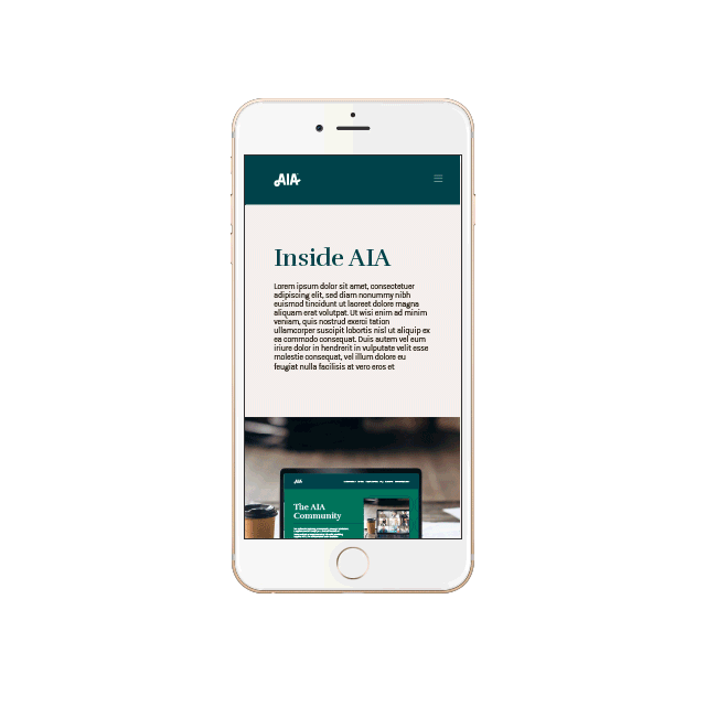
In today’s environment where change is the only constant, the ability to evolve while retaining one's core identity is crucial. Quill Creative has demonstrated this skill brilliantly with AIA's brand refresh. It's a testament to their strategic thinking, creative execution, and deep understanding of brand dynamics in a competitive landscape.
Stacy Price, VP Marketing, AIA Corporation


Because this was a rebrand for a business that already had a great reputation for exceptional care, we knew we needed to maintain and leverage as much of that brand equity as possible while providing a comprehensive new visual identity that captured the core mission of the business. Paramount to the rebrand was finding a new business name that clearly and simply conveyed the service offered and reinforced the organization’s commitment to enabling seniors to stride confidently through their golden years, supported by compassionate and personalized care.

We approached this rebrand with a mission-first mindset, visually translating the heart of the business’ mission into rich, approachable tones with sophisticated accent colors that differentiated them as a business but didn’t stray too far from their former brand or diminish established brand equity.
For elements and imagery, we used sketched illustrations and icons that showcase the nurturing care that Senior Stride provides. We incorporated lighthearted imagery showcasing both seniors enjoying their independent lives as well as the smiling faces of caregivers that evoked a feeling of genuine care and happiness.
We crafted a typographical hierarchy with a two-fold approach, knowing we wanted modern “high-end” fonts that felt welcoming and premium while also making sure that the selected fonts would be well-contrasted and easy to read for the intended audience.
When crafting the new name, we followed our process and chose Senior Stride to clearly and easily capture the core message of the business–”We help seniors find their stride.” Pairing this message with a new, modern logo with a sense of movement that represented each client’s journey.


Senior Stride’s new brand embodies a sense of vitality and empowerment and conveys a simple, clear message to their clients about their core service and philosophy of care. Each element of the new brand works together to create a comforting, consistent feeling across all touchpoints.


If you are seeking a partner to embark on a journey of brand transformation, I wholeheartedly recommend Quill. Their ability to combine strategic brilliance with creative excellence is a rare find in the industry!
Ellie Gunville, Co-Owner, E-Power Digital Marketing


Because this was a rebrand for a business that already had a great reputation for exceptional care, we knew we needed to maintain and leverage as much of that brand equity as possible while providing a comprehensive new visual identity that captured the core mission of the business. Paramount to the rebrand was finding a new business name that clearly and simply conveyed the service offered and reinforced the organization’s commitment to enabling seniors to stride confidently through their golden years, supported by compassionate and personalized care.


We approached this rebrand with a mission-first mindset, visually translating the heart of the business’ mission into rich, approachable tones with sophisticated accent colors that differentiated them as a business but didn’t stray too far from their former brand or diminish established brand equity.
For elements and imagery, we used sketched illustrations and icons that showcase the nurturing care that Senior Stride provides. We incorporated lighthearted imagery showcasing both seniors enjoying their independent lives as well as the smiling faces of caregivers that evoked a feeling of genuine care and happiness.
We crafted a typographical hierarchy with a two-fold approach, knowing we wanted modern “high-end” fonts that felt welcoming and premium while also making sure that the selected fonts would be well-contrasted and easy to read for the intended audience.
When crafting the new name, we followed our process and chose Senior Stride to clearly and easily capture the core message of the business–”We help seniors find their stride.” Pairing this message with a new, modern logo with a sense of movement that represented each client’s journey.


Senior Stride’s new brand embodies a sense of vitality and empowerment and conveys a simple, clear message to their clients about their core service and philosophy of care. Each element of the new brand works together to create a comforting, consistent feeling across all touchpoints.


Quill Creative has been the creative design firm of choice for Fork Farms since its inception. Their ability to grow and evolve brand strategy and design along with our company growth has allowed us to more effectively reach and build relationships with customers.
Alex Tyink, President, Fork Farms

Because this was a rebrand for a business that already had a great reputation for exceptional care, we knew we needed to maintain and leverage as much of that brand equity as possible while providing a comprehensive new visual identity that captured the core mission of the business. Paramount to the rebrand was finding a new business name that clearly and simply conveyed the service offered and reinforced the organization’s commitment to enabling seniors to stride confidently through their golden years, supported by compassionate and personalized care.


We approached this rebrand with a mission-first mindset, visually translating the heart of the business’ mission into rich, approachable tones with sophisticated accent colors that differentiated them as a business but didn’t stray too far from their former brand or diminish established brand equity.
For elements and imagery, we used sketched illustrations and icons that showcase the nurturing care that Senior Stride provides. We incorporated lighthearted imagery showcasing both seniors enjoying their independent lives as well as the smiling faces of caregivers that evoked a feeling of genuine care and happiness.
We crafted a typographical hierarchy with a two-fold approach, knowing we wanted modern “high-end” fonts that felt welcoming and premium while also making sure that the selected fonts would be well-contrasted and easy to read for the intended audience.
When crafting the new name, we followed our process and chose Senior Stride to clearly and easily capture the core message of the business–”We help seniors find their stride.” Pairing this message with a new, modern logo with a sense of movement that represented each client’s journey.


Quill Creative has been the creative design firm of choice for Fork Farms since its inception. Their ability to grow and evolve brand strategy and design along with our company growth has allowed us to more effectively reach and build relationships with customers.
Alex Tyink, President, Fork Farms


Because this was a rebrand for a business that already had a great reputation for exceptional care, we knew we needed to maintain and leverage as much of that brand equity as possible while providing a comprehensive new visual identity that captured the core mission of the business. Paramount to the rebrand was finding a new business name that clearly and simply conveyed the service offered and reinforced the organization’s commitment to enabling seniors to stride confidently through their golden years, supported by compassionate and personalized care.


We approached this rebrand with a mission-first mindset, visually translating the heart of the business’ mission into rich, approachable tones with sophisticated accent colors that differentiated them as a business but didn’t stray too far from their former brand or diminish established brand equity.
For elements and imagery, we used sketched illustrations and icons that showcase the nurturing care that Senior Stride provides. We incorporated lighthearted imagery showcasing both seniors enjoying their independent lives as well as the smiling faces of caregivers that evoked a feeling of genuine care and happiness.
We crafted a typographical hierarchy with a two-fold approach, knowing we wanted modern “high-end” fonts that felt welcoming and premium while also making sure that the selected fonts would be well-contrasted and easy to read for the intended audience.
When crafting the new name, we followed our process and chose Senior Stride to clearly and easily capture the core message of the business–”We help seniors find their stride.” Pairing this message with a new, modern logo with a sense of movement that represented each client’s journey.


Senior Stride’s new brand embodies a sense of vitality and empowerment and conveys a simple, clear message to their clients about their core service and philosophy of care. Each element of the new brand works together to create a comforting, consistent feeling across all touchpoints.


Working with Quill on our annual report always leaves us with a compelling and impactful piece that helps tell our story and illustrate how we are living out our mission. We are always excited to share the finished product with our donors and partners.
Lisa Endl, Director of Communications, Feeding America Eastern Wisconsin


Because this was a rebrand for a business that already had a great reputation for exceptional care, we knew we needed to maintain and leverage as much of that brand equity as possible while providing a comprehensive new visual identity that captured the core mission of the business. Paramount to the rebrand was finding a new business name that clearly and simply conveyed the service offered and reinforced the organization’s commitment to enabling seniors to stride confidently through their golden years, supported by compassionate and personalized care.


We approached this rebrand with a mission-first mindset, visually translating the heart of the business’ mission into rich, approachable tones with sophisticated accent colors that differentiated them as a business but didn’t stray too far from their former brand or diminish established brand equity.
For elements and imagery, we used sketched illustrations and icons that showcase the nurturing care that Senior Stride provides. We incorporated lighthearted imagery showcasing both seniors enjoying their independent lives as well as the smiling faces of caregivers that evoked a feeling of genuine care and happiness.
We crafted a typographical hierarchy with a two-fold approach, knowing we wanted modern “high-end” fonts that felt welcoming and premium while also making sure that the selected fonts would be well-contrasted and easy to read for the intended audience.
When crafting the new name, we followed our process and chose Senior Stride to clearly and easily capture the core message of the business–”We help seniors find their stride.” Pairing this message with a new, modern logo with a sense of movement that represented each client’s journey.


Senior Stride’s new brand embodies a sense of vitality and empowerment and conveys a simple, clear message to their clients about their core service and philosophy of care. Each element of the new brand works together to create a comforting, consistent feeling across all touchpoints.


Updating the brand of the oldest business in Wisconsin still owned by a legacy family member, was not to be taken lightly. What we liked best about working with Quill was their respect for the past, while still forging a current brand strategy, supported with great creativity, to help us grow for another 100 years. It’s a very open and transparent relationship with great communication along the way.
Mark Elliott, Brand Packaging Sales & Marketing, Castle pierce

Because this was a rebrand for a business that already had a great reputation for exceptional care, we knew we needed to maintain and leverage as much of that brand equity as possible while providing a comprehensive new visual identity that captured the core mission of the business. Paramount to the rebrand was finding a new business name that clearly and simply conveyed the service offered and reinforced the organization’s commitment to enabling seniors to stride confidently through their golden years, supported by compassionate and personalized care.


We approached this rebrand with a mission-first mindset, visually translating the heart of the business’ mission into rich, approachable tones with sophisticated accent colors that differentiated them as a business but didn’t stray too far from their former brand or diminish established brand equity.
For elements and imagery, we used sketched illustrations and icons that showcase the nurturing care that Senior Stride provides. We incorporated lighthearted imagery showcasing both seniors enjoying their independent lives as well as the smiling faces of caregivers that evoked a feeling of genuine care and happiness.
We crafted a typographical hierarchy with a two-fold approach, knowing we wanted modern “high-end” fonts that felt welcoming and premium while also making sure that the selected fonts would be well-contrasted and easy to read for the intended audience.
When crafting the new name, we followed our process and chose Senior Stride to clearly and easily capture the core message of the business–”We help seniors find their stride.” Pairing this message with a new, modern logo with a sense of movement that represented each client’s journey.


Senior Stride’s new brand embodies a sense of vitality and empowerment and conveys a simple, clear message to their clients about their core service and philosophy of care. Each element of the new brand works together to create a comforting, consistent feeling across all touchpoints.


What’s impressive is how Quill understood a complex technical product and simplified the message for general public understanding. This was done with a high level of respect, professionalism, and little use of our company time. Then the Maya Pet package designs won American Package Design Awards from GDUSA Magazine.
Richard Breunig, Founder & President, Priority IAC

Because this was a rebrand for a business that already had a great reputation for exceptional care, we knew we needed to maintain and leverage as much of that brand equity as possible while providing a comprehensive new visual identity that captured the core mission of the business. Paramount to the rebrand was finding a new business name that clearly and simply conveyed the service offered and reinforced the organization’s commitment to enabling seniors to stride confidently through their golden years, supported by compassionate and personalized care.


We approached this rebrand with a mission-first mindset, visually translating the heart of the business’ mission into rich, approachable tones with sophisticated accent colors that differentiated them as a business but didn’t stray too far from their former brand or diminish established brand equity.
For elements and imagery, we used sketched illustrations and icons that showcase the nurturing care that Senior Stride provides. We incorporated lighthearted imagery showcasing both seniors enjoying their independent lives as well as the smiling faces of caregivers that evoked a feeling of genuine care and happiness.
We crafted a typographical hierarchy with a two-fold approach, knowing we wanted modern “high-end” fonts that felt welcoming and premium while also making sure that the selected fonts would be well-contrasted and easy to read for the intended audience.
When crafting the new name, we followed our process and chose Senior Stride to clearly and easily capture the core message of the business–”We help seniors find their stride.” Pairing this message with a new, modern logo with a sense of movement that represented each client’s journey.


Senior Stride’s new brand embodies a sense of vitality and empowerment and conveys a simple, clear message to their clients about their core service and philosophy of care. Each element of the new brand works together to create a comforting, consistent feeling across all touchpoints.


What’s impressive is how Quill understood a complex technical product and simplified the message for general public understanding. This was done with a high level of respect, professionalism, and little use of our company time. Then the Somaya Life package designs won American Package Design Awards from GDUSA Magazine.
Richard Breunig, Founder & President, Priority IAC


Because this was a rebrand for a business that already had a great reputation for exceptional care, we knew we needed to maintain and leverage as much of that brand equity as possible while providing a comprehensive new visual identity that captured the core mission of the business. Paramount to the rebrand was finding a new business name that clearly and simply conveyed the service offered and reinforced the organization’s commitment to enabling seniors to stride confidently through their golden years, supported by compassionate and personalized care.

We approached this rebrand with a mission-first mindset, visually translating the heart of the business’ mission into rich, approachable tones with sophisticated accent colors that differentiated them as a business but didn’t stray too far from their former brand or diminish established brand equity.
For elements and imagery, we used sketched illustrations and icons that showcase the nurturing care that Senior Stride provides. We incorporated lighthearted imagery showcasing both seniors enjoying their independent lives as well as the smiling faces of caregivers that evoked a feeling of genuine care and happiness.
We crafted a typographical hierarchy with a two-fold approach, knowing we wanted modern “high-end” fonts that felt welcoming and premium while also making sure that the selected fonts would be well-contrasted and easy to read for the intended audience.
When crafting the new name, we followed our process and chose Senior Stride to clearly and easily capture the core message of the business–”We help seniors find their stride.” Pairing this message with a new, modern logo with a sense of movement that represented each client’s journey.


Senior Stride’s new brand embodies a sense of vitality and empowerment and conveys a simple, clear message to their clients about their core service and philosophy of care. Each element of the new brand works together to create a comforting, consistent feeling across all touchpoints.


Because this was a rebrand for a business that already had a great reputation for exceptional care, we knew we needed to maintain and leverage as much of that brand equity as possible while providing a comprehensive new visual identity that captured the core mission of the business. Paramount to the rebrand was finding a new business name that clearly and simply conveyed the service offered and reinforced the organization’s commitment to enabling seniors to stride confidently through their golden years, supported by compassionate and personalized care.
We approached this rebrand with a mission-first mindset, visually translating the heart of the business’ mission into rich, approachable tones with sophisticated accent colors that differentiated them as a business but didn’t stray too far from their former brand or diminish established brand equity.
For elements and imagery, we used sketched illustrations and icons that showcase the nurturing care that Senior Stride provides. We incorporated lighthearted imagery showcasing both seniors enjoying their independent lives as well as the smiling faces of caregivers that evoked a feeling of genuine care and happiness.
We crafted a typographical hierarchy with a two-fold approach, knowing we wanted modern “high-end” fonts that felt welcoming and premium while also making sure that the selected fonts would be well-contrasted and easy to read for the intended audience.
When crafting the new name, we followed our process and chose Senior Stride to clearly and easily capture the core message of the business–”We help seniors find their stride.” Pairing this message with a new, modern logo with a sense of movement that represented each client’s journey.


Senior Stride’s new brand embodies a sense of vitality and empowerment and conveys a simple, clear message to their clients about their core service and philosophy of care. Each element of the new brand works together to create a comforting, consistent feeling across all touchpoints.


Working with Quill has been a priceless asset to our company! They are extremely talented and their work is impeccable. Their team helped bring our company alive in award winning ways! Their communication and timeliness makes working with them seamless and extremely easy. They really do all they can to meet every one of our needs. We are so appreciative of their hard work!
Dr. Stephanie Matulle, AyD, CAS, AHC, RYT - Owner, Clinical Ayurvedic Doctor, Arise balanced wellness


Because this was a rebrand for a business that already had a great reputation for exceptional care, we knew we needed to maintain and leverage as much of that brand equity as possible while providing a comprehensive new visual identity that captured the core mission of the business. Paramount to the rebrand was finding a new business name that clearly and simply conveyed the service offered and reinforced the organization’s commitment to enabling seniors to stride confidently through their golden years, supported by compassionate and personalized care.


We approached this rebrand with a mission-first mindset, visually translating the heart of the business’ mission into rich, approachable tones with sophisticated accent colors that differentiated them as a business but didn’t stray too far from their former brand or diminish established brand equity.
For elements and imagery, we used sketched illustrations and icons that showcase the nurturing care that Senior Stride provides. We incorporated lighthearted imagery showcasing both seniors enjoying their independent lives as well as the smiling faces of caregivers that evoked a feeling of genuine care and happiness.
We crafted a typographical hierarchy with a two-fold approach, knowing we wanted modern “high-end” fonts that felt welcoming and premium while also making sure that the selected fonts would be well-contrasted and easy to read for the intended audience.
When crafting the new name, we followed our process and chose Senior Stride to clearly and easily capture the core message of the business–”We help seniors find their stride.” Pairing this message with a new, modern logo with a sense of movement that represented each client’s journey.


Senior Stride’s new brand embodies a sense of vitality and empowerment and conveys a simple, clear message to their clients about their core service and philosophy of care. Each element of the new brand works together to create a comforting, consistent feeling across all touchpoints.


Quill helped us define the intangible of our organization. They were there at every step to help us, they dived deep into our history and found a brand that felt like us. Can't say enough about them or their process.
Justin Kasper, President, MacDowell Male Chorus


Because this was a rebrand for a business that already had a great reputation for exceptional care, we knew we needed to maintain and leverage as much of that brand equity as possible while providing a comprehensive new visual identity that captured the core mission of the business. Paramount to the rebrand was finding a new business name that clearly and simply conveyed the service offered and reinforced the organization’s commitment to enabling seniors to stride confidently through their golden years, supported by compassionate and personalized care.

We approached this rebrand with a mission-first mindset, visually translating the heart of the business’ mission into rich, approachable tones with sophisticated accent colors that differentiated them as a business but didn’t stray too far from their former brand or diminish established brand equity.
For elements and imagery, we used sketched illustrations and icons that showcase the nurturing care that Senior Stride provides. We incorporated lighthearted imagery showcasing both seniors enjoying their independent lives as well as the smiling faces of caregivers that evoked a feeling of genuine care and happiness.
We crafted a typographical hierarchy with a two-fold approach, knowing we wanted modern “high-end” fonts that felt welcoming and premium while also making sure that the selected fonts would be well-contrasted and easy to read for the intended audience.
When crafting the new name, we followed our process and chose Senior Stride to clearly and easily capture the core message of the business–”We help seniors find their stride.” Pairing this message with a new, modern logo with a sense of movement that represented each client’s journey.


Senior Stride’s new brand embodies a sense of vitality and empowerment and conveys a simple, clear message to their clients about their core service and philosophy of care. Each element of the new brand works together to create a comforting, consistent feeling across all touchpoints.


Working with Quill taught me that branding is absolutely crucial for any product in any category. And they've been an absolute pleasure to work with from start to finish of my product rebrand. The team is very professional, extremely talented in creativity, design and messaging, and exceptional with communication. They know what they are doing, and their work shows.
Toni Maretti, Owner, Momentum Carnivore Nutrition

Because this was a rebrand for a business that already had a great reputation for exceptional care, we knew we needed to maintain and leverage as much of that brand equity as possible while providing a comprehensive new visual identity that captured the core mission of the business. Paramount to the rebrand was finding a new business name that clearly and simply conveyed the service offered and reinforced the organization’s commitment to enabling seniors to stride confidently through their golden years, supported by compassionate and personalized care.


We approached this rebrand with a mission-first mindset, visually translating the heart of the business’ mission into rich, approachable tones with sophisticated accent colors that differentiated them as a business but didn’t stray too far from their former brand or diminish established brand equity.
For elements and imagery, we used sketched illustrations and icons that showcase the nurturing care that Senior Stride provides. We incorporated lighthearted imagery showcasing both seniors enjoying their independent lives as well as the smiling faces of caregivers that evoked a feeling of genuine care and happiness.
We crafted a typographical hierarchy with a two-fold approach, knowing we wanted modern “high-end” fonts that felt welcoming and premium while also making sure that the selected fonts would be well-contrasted and easy to read for the intended audience.
When crafting the new name, we followed our process and chose Senior Stride to clearly and easily capture the core message of the business–”We help seniors find their stride.” Pairing this message with a new, modern logo with a sense of movement that represented each client’s journey.


Senior Stride’s new brand embodies a sense of vitality and empowerment and conveys a simple, clear message to their clients about their core service and philosophy of care. Each element of the new brand works together to create a comforting, consistent feeling across all touchpoints.


The team at Quill has done an amazing job taking our vision and turning it into a consistent and distinctive brand. The identity captures the essence of Sturgeon Spirits and brings it to life for all to enjoy.
Karl Loewenstein, Owner, Sturgeon Spirits Craft Distillery

Because this was a rebrand for a business that already had a great reputation for exceptional care, we knew we needed to maintain and leverage as much of that brand equity as possible while providing a comprehensive new visual identity that captured the core mission of the business. Paramount to the rebrand was finding a new business name that clearly and simply conveyed the service offered and reinforced the organization’s commitment to enabling seniors to stride confidently through their golden years, supported by compassionate and personalized care.


We approached this rebrand with a mission-first mindset, visually translating the heart of the business’ mission into rich, approachable tones with sophisticated accent colors that differentiated them as a business but didn’t stray too far from their former brand or diminish established brand equity.
For elements and imagery, we used sketched illustrations and icons that showcase the nurturing care that Senior Stride provides. We incorporated lighthearted imagery showcasing both seniors enjoying their independent lives as well as the smiling faces of caregivers that evoked a feeling of genuine care and happiness.
We crafted a typographical hierarchy with a two-fold approach, knowing we wanted modern “high-end” fonts that felt welcoming and premium while also making sure that the selected fonts would be well-contrasted and easy to read for the intended audience.
When crafting the new name, we followed our process and chose Senior Stride to clearly and easily capture the core message of the business–”We help seniors find their stride.” Pairing this message with a new, modern logo with a sense of movement that represented each client’s journey.
Senior Stride’s new brand embodies a sense of vitality and empowerment and conveys a simple, clear message to their clients about their core service and philosophy of care. Each element of the new brand works together to create a comforting, consistent feeling across all touchpoints.

Valley is fortunate to work with Quill Creative. Whether big or small, repeat or new, the Quill team always ensures each project reflects our brand and achieves the desired objective. This year, Quill helped us evolve our 2022 Annual Report to be a fresh, succinct and informative reflection of our previous year’s business. It is great to work with a creative partner who is not only a diligent steward of our brand, but also a visionary leader in the branding industry.
Sue bowden, vice president of product management and Marketing
valley cooperative association
Because this was a rebrand for a business that already had a great reputation for exceptional care, we knew we needed to maintain and leverage as much of that brand equity as possible while providing a comprehensive new visual identity that captured the core mission of the business. Paramount to the rebrand was finding a new business name that clearly and simply conveyed the service offered and reinforced the organization’s commitment to enabling seniors to stride confidently through their golden years, supported by compassionate and personalized care.


We approached this rebrand with a mission-first mindset, visually translating the heart of the business’ mission into rich, approachable tones with sophisticated accent colors that differentiated them as a business but didn’t stray too far from their former brand or diminish established brand equity.
For elements and imagery, we used sketched illustrations and icons that showcase the nurturing care that Senior Stride provides. We incorporated lighthearted imagery showcasing both seniors enjoying their independent lives as well as the smiling faces of caregivers that evoked a feeling of genuine care and happiness.
We crafted a typographical hierarchy with a two-fold approach, knowing we wanted modern “high-end” fonts that felt welcoming and premium while also making sure that the selected fonts would be well-contrasted and easy to read for the intended audience.
When crafting the new name, we followed our process and chose Senior Stride to clearly and easily capture the core message of the business–”We help seniors find their stride.” Pairing this message with a new, modern logo with a sense of movement that represented each client’s journey.


Senior Stride’s new brand embodies a sense of vitality and empowerment and conveys a simple, clear message to their clients about their core service and philosophy of care. Each element of the new brand works together to create a comforting, consistent feeling across all touchpoints.
Quill Creative has been the creative design firm of choice for Fork Farms since its inception. Their ability to grow and evolve brand strategy and design along with our company growth has allowed us to more effectively reach and build relationships with customers.
Alex Tyink, President, Fork Farms


Because this was a rebrand for a business that already had a great reputation for exceptional care, we knew we needed to maintain and leverage as much of that brand equity as possible while providing a comprehensive new visual identity that captured the core mission of the business. Paramount to the rebrand was finding a new business name that clearly and simply conveyed the service offered and reinforced the organization’s commitment to enabling seniors to stride confidently through their golden years, supported by compassionate and personalized care.


We approached this rebrand with a mission-first mindset, visually translating the heart of the business’ mission into rich, approachable tones with sophisticated accent colors that differentiated them as a business but didn’t stray too far from their former brand or diminish established brand equity.
For elements and imagery, we used sketched illustrations and icons that showcase the nurturing care that Senior Stride provides. We incorporated lighthearted imagery showcasing both seniors enjoying their independent lives as well as the smiling faces of caregivers that evoked a feeling of genuine care and happiness.
We crafted a typographical hierarchy with a two-fold approach, knowing we wanted modern “high-end” fonts that felt welcoming and premium while also making sure that the selected fonts would be well-contrasted and easy to read for the intended audience.
When crafting the new name, we followed our process and chose Senior Stride to clearly and easily capture the core message of the business–”We help seniors find their stride.” Pairing this message with a new, modern logo with a sense of movement that represented each client’s journey.


Senior Stride’s new brand embodies a sense of vitality and empowerment and conveys a simple, clear message to their clients about their core service and philosophy of care. Each element of the new brand works together to create a comforting, consistent feeling across all touchpoints.


Working with Quill to rebrand our over three decade old business has been incredible! Their design, the identity creation and attention to every detail is exceptional. They are fun and easy to work with and have expressed our company’s values perfectly!
Dr. Stephanie Matulle, Owner, Ally Tax & Accounting


Because this was a rebrand for a business that already had a great reputation for exceptional care, we knew we needed to maintain and leverage as much of that brand equity as possible while providing a comprehensive new visual identity that captured the core mission of the business. Paramount to the rebrand was finding a new business name that clearly and simply conveyed the service offered and reinforced the organization’s commitment to enabling seniors to stride confidently through their golden years, supported by compassionate and personalized care.
We approached this rebrand with a mission-first mindset, visually translating the heart of the business’ mission into rich, approachable tones with sophisticated accent colors that differentiated them as a business but didn’t stray too far from their former brand or diminish established brand equity.
For elements and imagery, we used sketched illustrations and icons that showcase the nurturing care that Senior Stride provides. We incorporated lighthearted imagery showcasing both seniors enjoying their independent lives as well as the smiling faces of caregivers that evoked a feeling of genuine care and happiness.
We crafted a typographical hierarchy with a two-fold approach, knowing we wanted modern “high-end” fonts that felt welcoming and premium while also making sure that the selected fonts would be well-contrasted and easy to read for the intended audience.
When crafting the new name, we followed our process and chose Senior Stride to clearly and easily capture the core message of the business–”We help seniors find their stride.” Pairing this message with a new, modern logo with a sense of movement that represented each client’s journey.


Senior Stride’s new brand embodies a sense of vitality and empowerment and conveys a simple, clear message to their clients about their core service and philosophy of care. Each element of the new brand works together to create a comforting, consistent feeling across all touchpoints.


Because this was a rebrand for a business that already had a great reputation for exceptional care, we knew we needed to maintain and leverage as much of that brand equity as possible while providing a comprehensive new visual identity that captured the core mission of the business. Paramount to the rebrand was finding a new business name that clearly and simply conveyed the service offered and reinforced the organization’s commitment to enabling seniors to stride confidently through their golden years, supported by compassionate and personalized care.

We approached this rebrand with a mission-first mindset, visually translating the heart of the business’ mission into rich, approachable tones with sophisticated accent colors that differentiated them as a business but didn’t stray too far from their former brand or diminish established brand equity.
For elements and imagery, we used sketched illustrations and icons that showcase the nurturing care that Senior Stride provides. We incorporated lighthearted imagery showcasing both seniors enjoying their independent lives as well as the smiling faces of caregivers that evoked a feeling of genuine care and happiness.
We crafted a typographical hierarchy with a two-fold approach, knowing we wanted modern “high-end” fonts that felt welcoming and premium while also making sure that the selected fonts would be well-contrasted and easy to read for the intended audience.
When crafting the new name, we followed our process and chose Senior Stride to clearly and easily capture the core message of the business–”We help seniors find their stride.” Pairing this message with a new, modern logo with a sense of movement that represented each client’s journey.


Senior Stride’s new brand embodies a sense of vitality and empowerment and conveys a simple, clear message to their clients about their core service and philosophy of care. Each element of the new brand works together to create a comforting, consistent feeling across all touchpoints.
We needed an identity to match our level of expertise & professionalism and Quill was the perfect team for the job. Most pool liner companies have the same old-school approach when it comes to branding & design, but Quill was able to breathe some fresh air on to this outdated, industry-standard style. From the clean, calming color palette, a creative new logo and unique website design, to our awesome new work vans, Quill gave us the exquisite “glow-up” we have been dreaming of for a long time.
Brittany Thurman, Assistant Director, AAA Liner Replacements


Because this was a rebrand for a business that already had a great reputation for exceptional care, we knew we needed to maintain and leverage as much of that brand equity as possible while providing a comprehensive new visual identity that captured the core mission of the business. Paramount to the rebrand was finding a new business name that clearly and simply conveyed the service offered and reinforced the organization’s commitment to enabling seniors to stride confidently through their golden years, supported by compassionate and personalized care.

We approached this rebrand with a mission-first mindset, visually translating the heart of the business’ mission into rich, approachable tones with sophisticated accent colors that differentiated them as a business but didn’t stray too far from their former brand or diminish established brand equity.
For elements and imagery, we used sketched illustrations and icons that showcase the nurturing care that Senior Stride provides. We incorporated lighthearted imagery showcasing both seniors enjoying their independent lives as well as the smiling faces of caregivers that evoked a feeling of genuine care and happiness.
We crafted a typographical hierarchy with a two-fold approach, knowing we wanted modern “high-end” fonts that felt welcoming and premium while also making sure that the selected fonts would be well-contrasted and easy to read for the intended audience.
When crafting the new name, we followed our process and chose Senior Stride to clearly and easily capture the core message of the business–”We help seniors find their stride.” Pairing this message with a new, modern logo with a sense of movement that represented each client’s journey.

Senior Stride’s new brand embodies a sense of vitality and empowerment and conveys a simple, clear message to their clients about their core service and philosophy of care. Each element of the new brand works together to create a comforting, consistent feeling across all touchpoints.


The Quill team was excellent to work with on our branding project. We were starting from scratch with no existing identity, but also had multiple stakeholders with vested interest which could have complicated the process. Ryan and the team were able to listen to our needs, research the limited examples in the market, and create something that reflected our asset. I greatly appreciated their ability to work with our project manager to keep things moving, but also the ability to present to the greater committee for feedback and approvals.
TRICIA RATHERMEL, PRESIDENT & CEO, GREATER OSHKOSH ECONOMIC DEVELOPMENT CORPORATION

Because this was a rebrand for a business that already had a great reputation for exceptional care, we knew we needed to maintain and leverage as much of that brand equity as possible while providing a comprehensive new visual identity that captured the core mission of the business. Paramount to the rebrand was finding a new business name that clearly and simply conveyed the service offered and reinforced the organization’s commitment to enabling seniors to stride confidently through their golden years, supported by compassionate and personalized care.


We approached this rebrand with a mission-first mindset, visually translating the heart of the business’ mission into rich, approachable tones with sophisticated accent colors that differentiated them as a business but didn’t stray too far from their former brand or diminish established brand equity.
For elements and imagery, we used sketched illustrations and icons that showcase the nurturing care that Senior Stride provides. We incorporated lighthearted imagery showcasing both seniors enjoying their independent lives as well as the smiling faces of caregivers that evoked a feeling of genuine care and happiness.
We crafted a typographical hierarchy with a two-fold approach, knowing we wanted modern “high-end” fonts that felt welcoming and premium while also making sure that the selected fonts would be well-contrasted and easy to read for the intended audience.
When crafting the new name, we followed our process and chose Senior Stride to clearly and easily capture the core message of the business–”We help seniors find their stride.” Pairing this message with a new, modern logo with a sense of movement that represented each client’s journey.

Senior Stride’s new brand embodies a sense of vitality and empowerment and conveys a simple, clear message to their clients about their core service and philosophy of care. Each element of the new brand works together to create a comforting, consistent feeling across all touchpoints.

The Quill team took our many ideas of what we wanted the campaign logo to portray, creating an easily recognizable look and message. At each step along the way, I knew that Ryan and his team were available to answer any questions we had.
Liz jansen, foundation director, mercy health foundation


Because this was a rebrand for a business that already had a great reputation for exceptional care, we knew we needed to maintain and leverage as much of that brand equity as possible while providing a comprehensive new visual identity that captured the core mission of the business. Paramount to the rebrand was finding a new business name that clearly and simply conveyed the service offered and reinforced the organization’s commitment to enabling seniors to stride confidently through their golden years, supported by compassionate and personalized care.


We approached this rebrand with a mission-first mindset, visually translating the heart of the business’ mission into rich, approachable tones with sophisticated accent colors that differentiated them as a business but didn’t stray too far from their former brand or diminish established brand equity.
For elements and imagery, we used sketched illustrations and icons that showcase the nurturing care that Senior Stride provides. We incorporated lighthearted imagery showcasing both seniors enjoying their independent lives as well as the smiling faces of caregivers that evoked a feeling of genuine care and happiness.
We crafted a typographical hierarchy with a two-fold approach, knowing we wanted modern “high-end” fonts that felt welcoming and premium while also making sure that the selected fonts would be well-contrasted and easy to read for the intended audience.
When crafting the new name, we followed our process and chose Senior Stride to clearly and easily capture the core message of the business–”We help seniors find their stride.” Pairing this message with a new, modern logo with a sense of movement that represented each client’s journey.

Senior Stride’s new brand embodies a sense of vitality and empowerment and conveys a simple, clear message to their clients about their core service and philosophy of care. Each element of the new brand works together to create a comforting, consistent feeling across all touchpoints.


From initial concept discussions through creative brief and end product the team at Quill was responsive, receptive and thorough.
Kathi Hegranes, Injury Prevention & Outreach Coordinator, ThedaCare

Because this was a rebrand for a business that already had a great reputation for exceptional care, we knew we needed to maintain and leverage as much of that brand equity as possible while providing a comprehensive new visual identity that captured the core mission of the business. Paramount to the rebrand was finding a new business name that clearly and simply conveyed the service offered and reinforced the organization’s commitment to enabling seniors to stride confidently through their golden years, supported by compassionate and personalized care.
We approached this rebrand with a mission-first mindset, visually translating the heart of the business’ mission into rich, approachable tones with sophisticated accent colors that differentiated them as a business but didn’t stray too far from their former brand or diminish established brand equity.
For elements and imagery, we used sketched illustrations and icons that showcase the nurturing care that Senior Stride provides. We incorporated lighthearted imagery showcasing both seniors enjoying their independent lives as well as the smiling faces of caregivers that evoked a feeling of genuine care and happiness.
We crafted a typographical hierarchy with a two-fold approach, knowing we wanted modern “high-end” fonts that felt welcoming and premium while also making sure that the selected fonts would be well-contrasted and easy to read for the intended audience.
When crafting the new name, we followed our process and chose Senior Stride to clearly and easily capture the core message of the business–”We help seniors find their stride.” Pairing this message with a new, modern logo with a sense of movement that represented each client’s journey.


Senior Stride’s new brand embodies a sense of vitality and empowerment and conveys a simple, clear message to their clients about their core service and philosophy of care. Each element of the new brand works together to create a comforting, consistent feeling across all touchpoints.


Because this was a rebrand for a business that already had a great reputation for exceptional care, we knew we needed to maintain and leverage as much of that brand equity as possible while providing a comprehensive new visual identity that captured the core mission of the business. Paramount to the rebrand was finding a new business name that clearly and simply conveyed the service offered and reinforced the organization’s commitment to enabling seniors to stride confidently through their golden years, supported by compassionate and personalized care.

We approached this rebrand with a mission-first mindset, visually translating the heart of the business’ mission into rich, approachable tones with sophisticated accent colors that differentiated them as a business but didn’t stray too far from their former brand or diminish established brand equity.
For elements and imagery, we used sketched illustrations and icons that showcase the nurturing care that Senior Stride provides. We incorporated lighthearted imagery showcasing both seniors enjoying their independent lives as well as the smiling faces of caregivers that evoked a feeling of genuine care and happiness.
We crafted a typographical hierarchy with a two-fold approach, knowing we wanted modern “high-end” fonts that felt welcoming and premium while also making sure that the selected fonts would be well-contrasted and easy to read for the intended audience.
When crafting the new name, we followed our process and chose Senior Stride to clearly and easily capture the core message of the business–”We help seniors find their stride.” Pairing this message with a new, modern logo with a sense of movement that represented each client’s journey.


Senior Stride’s new brand embodies a sense of vitality and empowerment and conveys a simple, clear message to their clients about their core service and philosophy of care. Each element of the new brand works together to create a comforting, consistent feeling across all touchpoints.
The team at Quill Creative was invested in my visual identity design from the moment I contacted them. Taking time to understand ISW and my vision was their first concern. The remainder of the process was timely, fluid and incorporated my feedback, and each team member I met was engaged with the product/concept they were delivering to me. I'm thrilled with the final results of ISW's updated Visual Identity brand.
Tom beatty, owner

Because this was a rebrand for a business that already had a great reputation for exceptional care, we knew we needed to maintain and leverage as much of that brand equity as possible while providing a comprehensive new visual identity that captured the core mission of the business. Paramount to the rebrand was finding a new business name that clearly and simply conveyed the service offered and reinforced the organization’s commitment to enabling seniors to stride confidently through their golden years, supported by compassionate and personalized care.

We approached this rebrand with a mission-first mindset, visually translating the heart of the business’ mission into rich, approachable tones with sophisticated accent colors that differentiated them as a business but didn’t stray too far from their former brand or diminish established brand equity.
For elements and imagery, we used sketched illustrations and icons that showcase the nurturing care that Senior Stride provides. We incorporated lighthearted imagery showcasing both seniors enjoying their independent lives as well as the smiling faces of caregivers that evoked a feeling of genuine care and happiness.
We crafted a typographical hierarchy with a two-fold approach, knowing we wanted modern “high-end” fonts that felt welcoming and premium while also making sure that the selected fonts would be well-contrasted and easy to read for the intended audience.
When crafting the new name, we followed our process and chose Senior Stride to clearly and easily capture the core message of the business–”We help seniors find their stride.” Pairing this message with a new, modern logo with a sense of movement that represented each client’s journey.

Senior Stride’s new brand embodies a sense of vitality and empowerment and conveys a simple, clear message to their clients about their core service and philosophy of care. Each element of the new brand works together to create a comforting, consistent feeling across all touchpoints.


The Quill team was creative, professional, and they clearly understood the bigger picture of our merger and rebrand. They adapted well to a changing environment and were solid partners with us on this project.
JOE MAUTHE, Executive Director

Because this was a rebrand for a business that already had a great reputation for exceptional care, we knew we needed to maintain and leverage as much of that brand equity as possible while providing a comprehensive new visual identity that captured the core mission of the business. Paramount to the rebrand was finding a new business name that clearly and simply conveyed the service offered and reinforced the organization’s commitment to enabling seniors to stride confidently through their golden years, supported by compassionate and personalized care.

We approached this rebrand with a mission-first mindset, visually translating the heart of the business’ mission into rich, approachable tones with sophisticated accent colors that differentiated them as a business but didn’t stray too far from their former brand or diminish established brand equity.
For elements and imagery, we used sketched illustrations and icons that showcase the nurturing care that Senior Stride provides. We incorporated lighthearted imagery showcasing both seniors enjoying their independent lives as well as the smiling faces of caregivers that evoked a feeling of genuine care and happiness.
We crafted a typographical hierarchy with a two-fold approach, knowing we wanted modern “high-end” fonts that felt welcoming and premium while also making sure that the selected fonts would be well-contrasted and easy to read for the intended audience.
When crafting the new name, we followed our process and chose Senior Stride to clearly and easily capture the core message of the business–”We help seniors find their stride.” Pairing this message with a new, modern logo with a sense of movement that represented each client’s journey.


Senior Stride’s new brand embodies a sense of vitality and empowerment and conveys a simple, clear message to their clients about their core service and philosophy of care. Each element of the new brand works together to create a comforting, consistent feeling across all touchpoints.


Because this was a rebrand for a business that already had a great reputation for exceptional care, we knew we needed to maintain and leverage as much of that brand equity as possible while providing a comprehensive new visual identity that captured the core mission of the business. Paramount to the rebrand was finding a new business name that clearly and simply conveyed the service offered and reinforced the organization’s commitment to enabling seniors to stride confidently through their golden years, supported by compassionate and personalized care.


We approached this rebrand with a mission-first mindset, visually translating the heart of the business’ mission into rich, approachable tones with sophisticated accent colors that differentiated them as a business but didn’t stray too far from their former brand or diminish established brand equity.
For elements and imagery, we used sketched illustrations and icons that showcase the nurturing care that Senior Stride provides. We incorporated lighthearted imagery showcasing both seniors enjoying their independent lives as well as the smiling faces of caregivers that evoked a feeling of genuine care and happiness.
We crafted a typographical hierarchy with a two-fold approach, knowing we wanted modern “high-end” fonts that felt welcoming and premium while also making sure that the selected fonts would be well-contrasted and easy to read for the intended audience.
When crafting the new name, we followed our process and chose Senior Stride to clearly and easily capture the core message of the business–”We help seniors find their stride.” Pairing this message with a new, modern logo with a sense of movement that represented each client’s journey.


Senior Stride’s new brand embodies a sense of vitality and empowerment and conveys a simple, clear message to their clients about their core service and philosophy of care. Each element of the new brand works together to create a comforting, consistent feeling across all touchpoints.

Over the last year I've had the pleasure of working with Quill Creative Services to refresh the brand of my family's business which is celebrating its 100th anniversary in 2021. On a scale of 100 for expectations I’d humbly give Quill a score of 200… The discovery, creative and implementation stages could not have gone smoother from my perspective as your typical/busy business owner. Quill invested the time to truly understand my company's history, personality, character, products, services and most importantly our customer base. The end product has taken our brand to a level that I frankly believe to be genius.
Matt MIller, PRESIDENT, HARRY MILLER COMPANIES

Because this was a rebrand for a business that already had a great reputation for exceptional care, we knew we needed to maintain and leverage as much of that brand equity as possible while providing a comprehensive new visual identity that captured the core mission of the business. Paramount to the rebrand was finding a new business name that clearly and simply conveyed the service offered and reinforced the organization’s commitment to enabling seniors to stride confidently through their golden years, supported by compassionate and personalized care.
We approached this rebrand with a mission-first mindset, visually translating the heart of the business’ mission into rich, approachable tones with sophisticated accent colors that differentiated them as a business but didn’t stray too far from their former brand or diminish established brand equity.
For elements and imagery, we used sketched illustrations and icons that showcase the nurturing care that Senior Stride provides. We incorporated lighthearted imagery showcasing both seniors enjoying their independent lives as well as the smiling faces of caregivers that evoked a feeling of genuine care and happiness.
We crafted a typographical hierarchy with a two-fold approach, knowing we wanted modern “high-end” fonts that felt welcoming and premium while also making sure that the selected fonts would be well-contrasted and easy to read for the intended audience.
When crafting the new name, we followed our process and chose Senior Stride to clearly and easily capture the core message of the business–”We help seniors find their stride.” Pairing this message with a new, modern logo with a sense of movement that represented each client’s journey.


Senior Stride’s new brand embodies a sense of vitality and empowerment and conveys a simple, clear message to their clients about their core service and philosophy of care. Each element of the new brand works together to create a comforting, consistent feeling across all touchpoints.


Because this was a rebrand for a business that already had a great reputation for exceptional care, we knew we needed to maintain and leverage as much of that brand equity as possible while providing a comprehensive new visual identity that captured the core mission of the business. Paramount to the rebrand was finding a new business name that clearly and simply conveyed the service offered and reinforced the organization’s commitment to enabling seniors to stride confidently through their golden years, supported by compassionate and personalized care.


We approached this rebrand with a mission-first mindset, visually translating the heart of the business’ mission into rich, approachable tones with sophisticated accent colors that differentiated them as a business but didn’t stray too far from their former brand or diminish established brand equity.
For elements and imagery, we used sketched illustrations and icons that showcase the nurturing care that Senior Stride provides. We incorporated lighthearted imagery showcasing both seniors enjoying their independent lives as well as the smiling faces of caregivers that evoked a feeling of genuine care and happiness.
We crafted a typographical hierarchy with a two-fold approach, knowing we wanted modern “high-end” fonts that felt welcoming and premium while also making sure that the selected fonts would be well-contrasted and easy to read for the intended audience.
When crafting the new name, we followed our process and chose Senior Stride to clearly and easily capture the core message of the business–”We help seniors find their stride.” Pairing this message with a new, modern logo with a sense of movement that represented each client’s journey.


Senior Stride’s new brand embodies a sense of vitality and empowerment and conveys a simple, clear message to their clients about their core service and philosophy of care. Each element of the new brand works together to create a comforting, consistent feeling across all touchpoints.


Our work is about community and connection. We needed a name and brand that was inviting and memorable. Quill helped us achieve both. We love working with Quill and highly recommend them to others.
Samantha Hilker, Community Health Strategist, Breakwater

Because this was a rebrand for a business that already had a great reputation for exceptional care, we knew we needed to maintain and leverage as much of that brand equity as possible while providing a comprehensive new visual identity that captured the core mission of the business. Paramount to the rebrand was finding a new business name that clearly and simply conveyed the service offered and reinforced the organization’s commitment to enabling seniors to stride confidently through their golden years, supported by compassionate and personalized care.

We approached this rebrand with a mission-first mindset, visually translating the heart of the business’ mission into rich, approachable tones with sophisticated accent colors that differentiated them as a business but didn’t stray too far from their former brand or diminish established brand equity.
For elements and imagery, we used sketched illustrations and icons that showcase the nurturing care that Senior Stride provides. We incorporated lighthearted imagery showcasing both seniors enjoying their independent lives as well as the smiling faces of caregivers that evoked a feeling of genuine care and happiness.
We crafted a typographical hierarchy with a two-fold approach, knowing we wanted modern “high-end” fonts that felt welcoming and premium while also making sure that the selected fonts would be well-contrasted and easy to read for the intended audience.
When crafting the new name, we followed our process and chose Senior Stride to clearly and easily capture the core message of the business–”We help seniors find their stride.” Pairing this message with a new, modern logo with a sense of movement that represented each client’s journey.


Senior Stride’s new brand embodies a sense of vitality and empowerment and conveys a simple, clear message to their clients about their core service and philosophy of care. Each element of the new brand works together to create a comforting, consistent feeling across all touchpoints.


Because this was a rebrand for a business that already had a great reputation for exceptional care, we knew we needed to maintain and leverage as much of that brand equity as possible while providing a comprehensive new visual identity that captured the core mission of the business. Paramount to the rebrand was finding a new business name that clearly and simply conveyed the service offered and reinforced the organization’s commitment to enabling seniors to stride confidently through their golden years, supported by compassionate and personalized care.


We approached this rebrand with a mission-first mindset, visually translating the heart of the business’ mission into rich, approachable tones with sophisticated accent colors that differentiated them as a business but didn’t stray too far from their former brand or diminish established brand equity.
For elements and imagery, we used sketched illustrations and icons that showcase the nurturing care that Senior Stride provides. We incorporated lighthearted imagery showcasing both seniors enjoying their independent lives as well as the smiling faces of caregivers that evoked a feeling of genuine care and happiness.
We crafted a typographical hierarchy with a two-fold approach, knowing we wanted modern “high-end” fonts that felt welcoming and premium while also making sure that the selected fonts would be well-contrasted and easy to read for the intended audience.
When crafting the new name, we followed our process and chose Senior Stride to clearly and easily capture the core message of the business–”We help seniors find their stride.” Pairing this message with a new, modern logo with a sense of movement that represented each client’s journey.


Senior Stride’s new brand embodies a sense of vitality and empowerment and conveys a simple, clear message to their clients about their core service and philosophy of care. Each element of the new brand works together to create a comforting, consistent feeling across all touchpoints.

Working with Quill on our annual report always leaves us with a compelling and impactful piece that helps tell our story and illustrate how we are living out our mission. We are always excited to share the finished product with our donors and partners.
Lisa Endl, Director of Communications, Feeding America Eastern Wisconsin

We approached this rebrand with a mission-first mindset, visually translating the heart of the business’ mission into rich, approachable tones with sophisticated accent colors that differentiated them as a business but didn’t stray too far from their former brand or diminish established brand equity.
For elements and imagery, we used sketched illustrations and icons that showcase the nurturing care that Senior Stride provides. We incorporated lighthearted imagery showcasing both seniors enjoying their independent lives as well as the smiling faces of caregivers that evoked a feeling of genuine care and happiness.
We crafted a typographical hierarchy with a two-fold approach, knowing we wanted modern “high-end” fonts that felt welcoming and premium while also making sure that the selected fonts would be well-contrasted and easy to read for the intended audience.
When crafting the new name, we followed our process and chose Senior Stride to clearly and easily capture the core message of the business–”We help seniors find their stride.” Pairing this message with a new, modern logo with a sense of movement that represented each client’s journey.

Because this was a rebrand for a business that already had a great reputation for exceptional care, we knew we needed to maintain and leverage as much of that brand equity as possible while providing a comprehensive new visual identity that captured the core mission of the business. Paramount to the rebrand was finding a new business name that clearly and simply conveyed the service offered and reinforced the organization’s commitment to enabling seniors to stride confidently through their golden years, supported by compassionate and personalized care.

Senior Stride’s new brand embodies a sense of vitality and empowerment and conveys a simple, clear message to their clients about their core service and philosophy of care. Each element of the new brand works together to create a comforting, consistent feeling across all touchpoints.


Senior Stride’s new brand embodies a sense of vitality and empowerment and conveys a simple, clear message to their clients about their core service and philosophy of care. Each element of the new brand works together to create a comforting, consistent feeling across all touchpoints.
Quill did a terrific job for us at Craft Coating! They helped with everything from our name, logo and branding. I would highly recommend using them.
Aaron Johnson, President, Craft Coating


Because this was a rebrand for a business that already had a great reputation for exceptional care, we knew we needed to maintain and leverage as much of that brand equity as possible while providing a comprehensive new visual identity that captured the core mission of the business. Paramount to the rebrand was finding a new business name that clearly and simply conveyed the service offered and reinforced the organization’s commitment to enabling seniors to stride confidently through their golden years, supported by compassionate and personalized care.

We approached this rebrand with a mission-first mindset, visually translating the heart of the business’ mission into rich, approachable tones with sophisticated accent colors that differentiated them as a business but didn’t stray too far from their former brand or diminish established brand equity.
For elements and imagery, we used sketched illustrations and icons that showcase the nurturing care that Senior Stride provides. We incorporated lighthearted imagery showcasing both seniors enjoying their independent lives as well as the smiling faces of caregivers that evoked a feeling of genuine care and happiness.
We crafted a typographical hierarchy with a two-fold approach, knowing we wanted modern “high-end” fonts that felt welcoming and premium while also making sure that the selected fonts would be well-contrasted and easy to read for the intended audience.
When crafting the new name, we followed our process and chose Senior Stride to clearly and easily capture the core message of the business–”We help seniors find their stride.” Pairing this message with a new, modern logo with a sense of movement that represented each client’s journey.


Senior Stride’s new brand embodies a sense of vitality and empowerment and conveys a simple, clear message to their clients about their core service and philosophy of care. Each element of the new brand works together to create a comforting, consistent feeling across all touchpoints.


Senior Stride’s new brand embodies a sense of vitality and empowerment and conveys a simple, clear message to their clients about their core service and philosophy of care. Each element of the new brand works together to create a comforting, consistent feeling across all touchpoints.
Because this was a rebrand for a business that already had a great reputation for exceptional care, we knew we needed to maintain and leverage as much of that brand equity as possible while providing a comprehensive new visual identity that captured the core mission of the business. Paramount to the rebrand was finding a new business name that clearly and simply conveyed the service offered and reinforced the organization’s commitment to enabling seniors to stride confidently through their golden years, supported by compassionate and personalized care.

We approached this rebrand with a mission-first mindset, visually translating the heart of the business’ mission into rich, approachable tones with sophisticated accent colors that differentiated them as a business but didn’t stray too far from their former brand or diminish established brand equity.
For elements and imagery, we used sketched illustrations and icons that showcase the nurturing care that Senior Stride provides. We incorporated lighthearted imagery showcasing both seniors enjoying their independent lives as well as the smiling faces of caregivers that evoked a feeling of genuine care and happiness.
We crafted a typographical hierarchy with a two-fold approach, knowing we wanted modern “high-end” fonts that felt welcoming and premium while also making sure that the selected fonts would be well-contrasted and easy to read for the intended audience.
When crafting the new name, we followed our process and chose Senior Stride to clearly and easily capture the core message of the business–”We help seniors find their stride.” Pairing this message with a new, modern logo with a sense of movement that represented each client’s journey.

Senior Stride’s new brand embodies a sense of vitality and empowerment and conveys a simple, clear message to their clients about their core service and philosophy of care. Each element of the new brand works together to create a comforting, consistent feeling across all touchpoints.

Senior Stride’s new brand embodies a sense of vitality and empowerment and conveys a simple, clear message to their clients about their core service and philosophy of care. Each element of the new brand works together to create a comforting, consistent feeling across all touchpoints.
The Quill team did a great job translating years of historical knowledge and evolving design systems to develop our Brand Guide, which has become a great resource tool for our company and our partners. They are great listeners and great partners who worked tirelessly to complete this big project and we highly recommend Quill Creative.
Mandy Bottomlee, Director of Content Marketing, Good Foods


Because this was a rebrand for a business that already had a great reputation for exceptional care, we knew we needed to maintain and leverage as much of that brand equity as possible while providing a comprehensive new visual identity that captured the core mission of the business. Paramount to the rebrand was finding a new business name that clearly and simply conveyed the service offered and reinforced the organization’s commitment to enabling seniors to stride confidently through their golden years, supported by compassionate and personalized care.
Senior Stride’s new brand embodies a sense of vitality and empowerment and conveys a simple, clear message to their clients about their core service and philosophy of care. Each element of the new brand works together to create a comforting, consistent feeling across all touchpoints.

We approached this rebrand with a mission-first mindset, visually translating the heart of the business’ mission into rich, approachable tones with sophisticated accent colors that differentiated them as a business but didn’t stray too far from their former brand or diminish established brand equity.
For elements and imagery, we used sketched illustrations and icons that showcase the nurturing care that Senior Stride provides. We incorporated lighthearted imagery showcasing both seniors enjoying their independent lives as well as the smiling faces of caregivers that evoked a feeling of genuine care and happiness.
We crafted a typographical hierarchy with a two-fold approach, knowing we wanted modern “high-end” fonts that felt welcoming and premium while also making sure that the selected fonts would be well-contrasted and easy to read for the intended audience.
When crafting the new name, we followed our process and chose Senior Stride to clearly and easily capture the core message of the business–”We help seniors find their stride.” Pairing this message with a new, modern logo with a sense of movement that represented each client’s journey.


Senior Stride’s new brand embodies a sense of vitality and empowerment and conveys a simple, clear message to their clients about their core service and philosophy of care. Each element of the new brand works together to create a comforting, consistent feeling across all touchpoints.


Because this was a rebrand for a business that already had a great reputation for exceptional care, we knew we needed to maintain and leverage as much of that brand equity as possible while providing a comprehensive new visual identity that captured the core mission of the business. Paramount to the rebrand was finding a new business name that clearly and simply conveyed the service offered and reinforced the organization’s commitment to enabling seniors to stride confidently through their golden years, supported by compassionate and personalized care.


We approached this rebrand with a mission-first mindset, visually translating the heart of the business’ mission into rich, approachable tones with sophisticated accent colors that differentiated them as a business but didn’t stray too far from their former brand or diminish established brand equity.
For elements and imagery, we used sketched illustrations and icons that showcase the nurturing care that Senior Stride provides. We incorporated lighthearted imagery showcasing both seniors enjoying their independent lives as well as the smiling faces of caregivers that evoked a feeling of genuine care and happiness.
We crafted a typographical hierarchy with a two-fold approach, knowing we wanted modern “high-end” fonts that felt welcoming and premium while also making sure that the selected fonts would be well-contrasted and easy to read for the intended audience.
When crafting the new name, we followed our process and chose Senior Stride to clearly and easily capture the core message of the business–”We help seniors find their stride.” Pairing this message with a new, modern logo with a sense of movement that represented each client’s journey.

Senior Stride’s new brand embodies a sense of vitality and empowerment and conveys a simple, clear message to their clients about their core service and philosophy of care. Each element of the new brand works together to create a comforting, consistent feeling across all touchpoints.


We have had an incredible response from our customers since rebranding with Quill. The entire rebranding process was fun and exciting and really opened the door to getting our company to the next level. In addition to increased revenue, Quill’s creative strategy beautifully rejuvenated our look and feel and helped us educate and inspire our customer base. Their team is full of talented true creatives, and we really look forward to future projects together.
Brittany THurman, creative director, linerworld